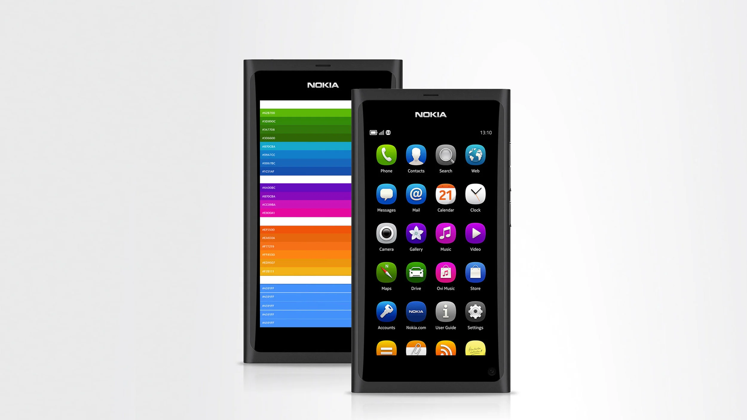
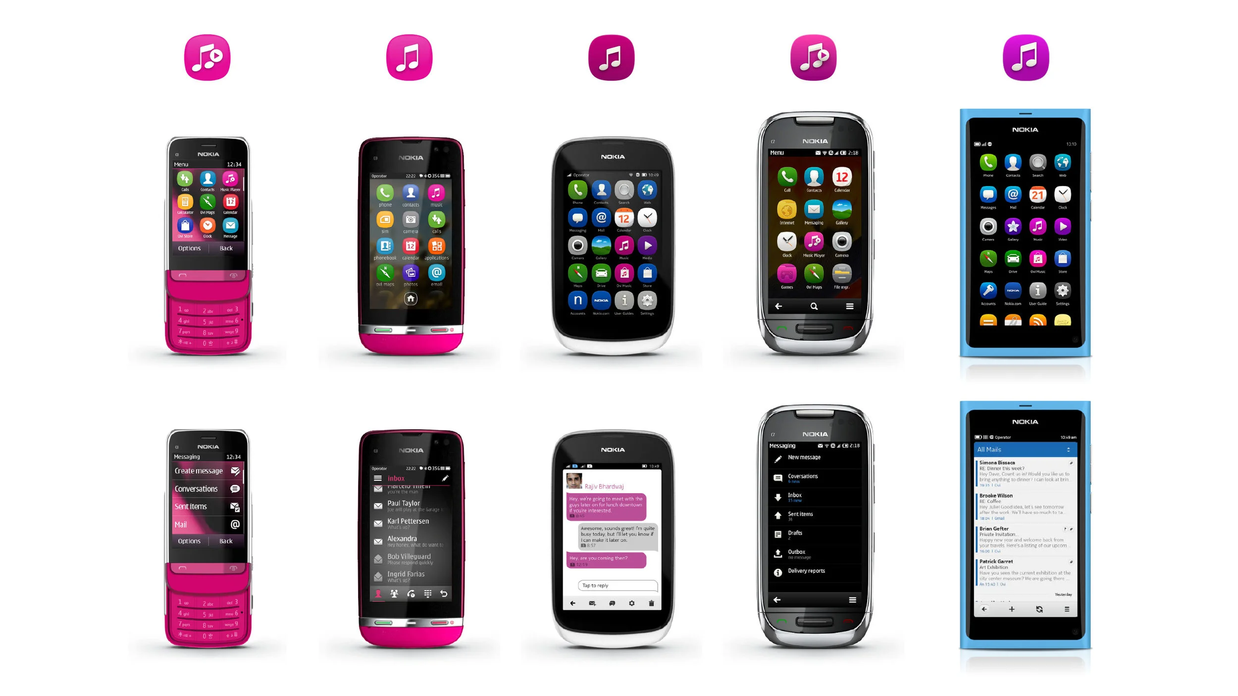
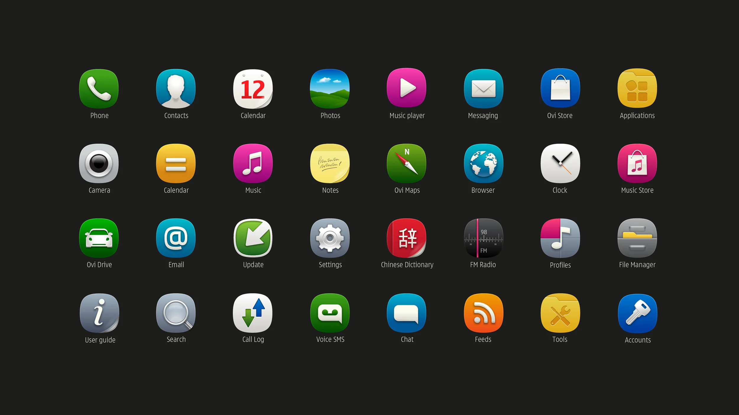
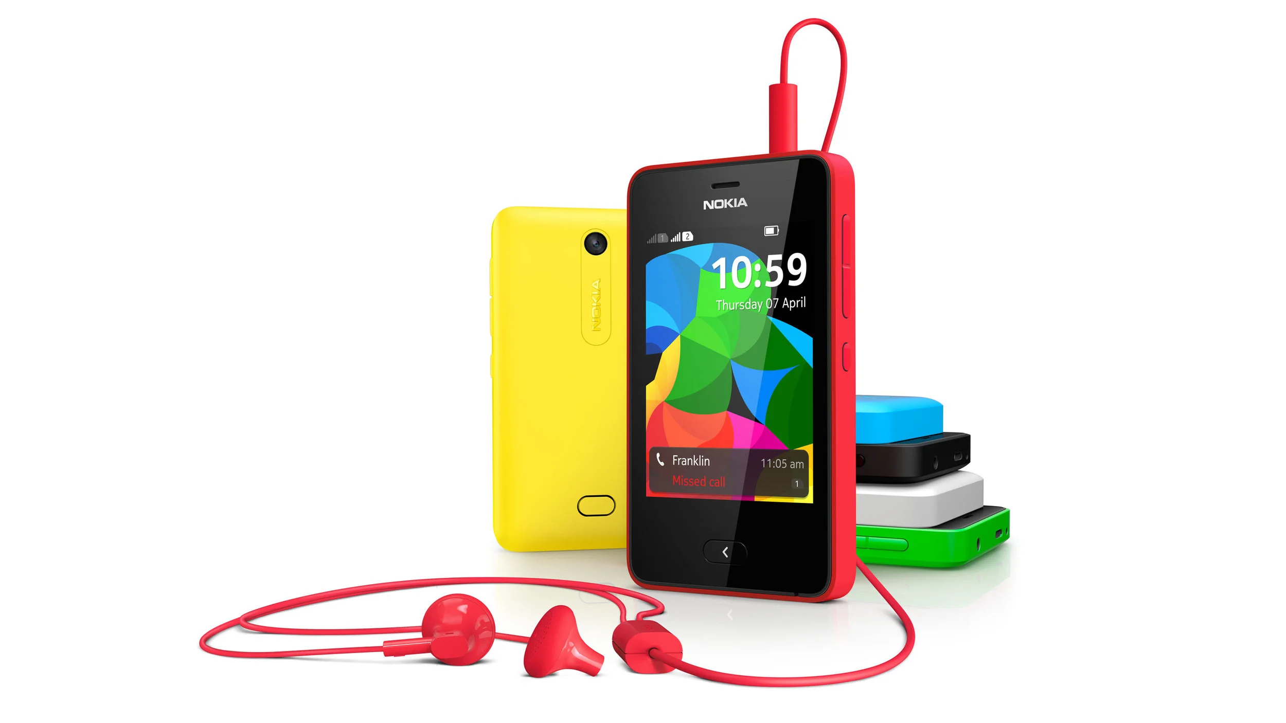
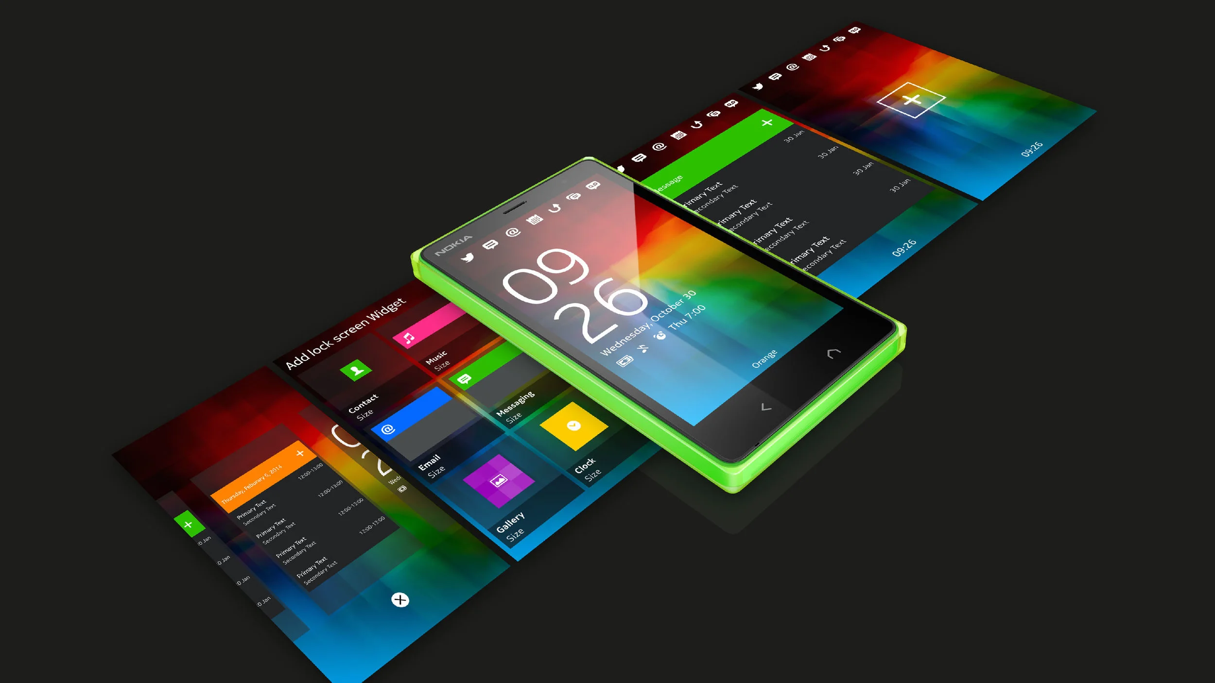
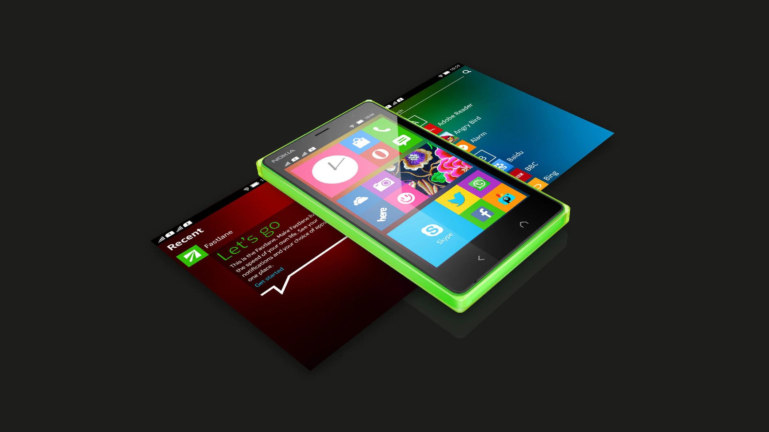
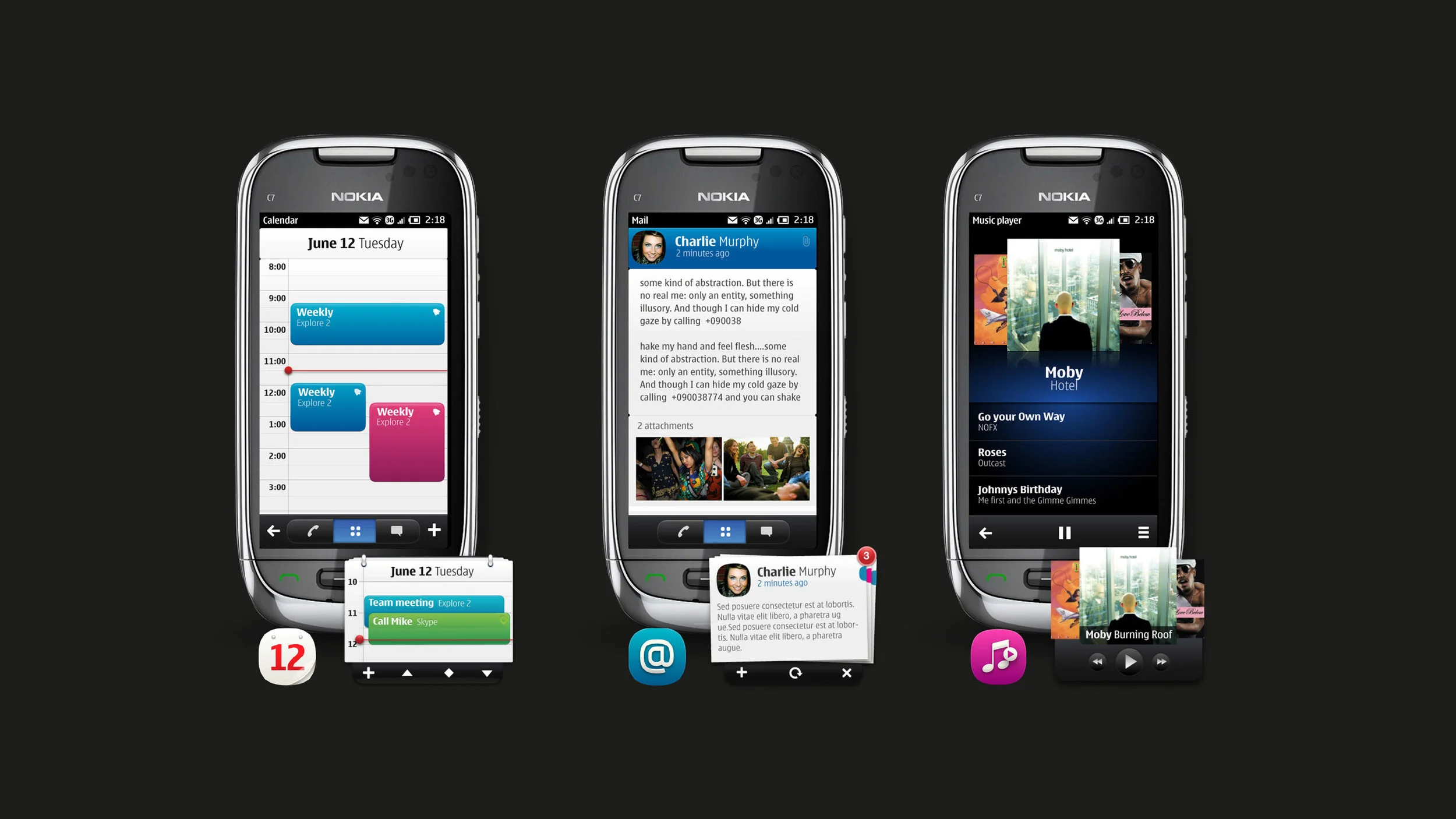
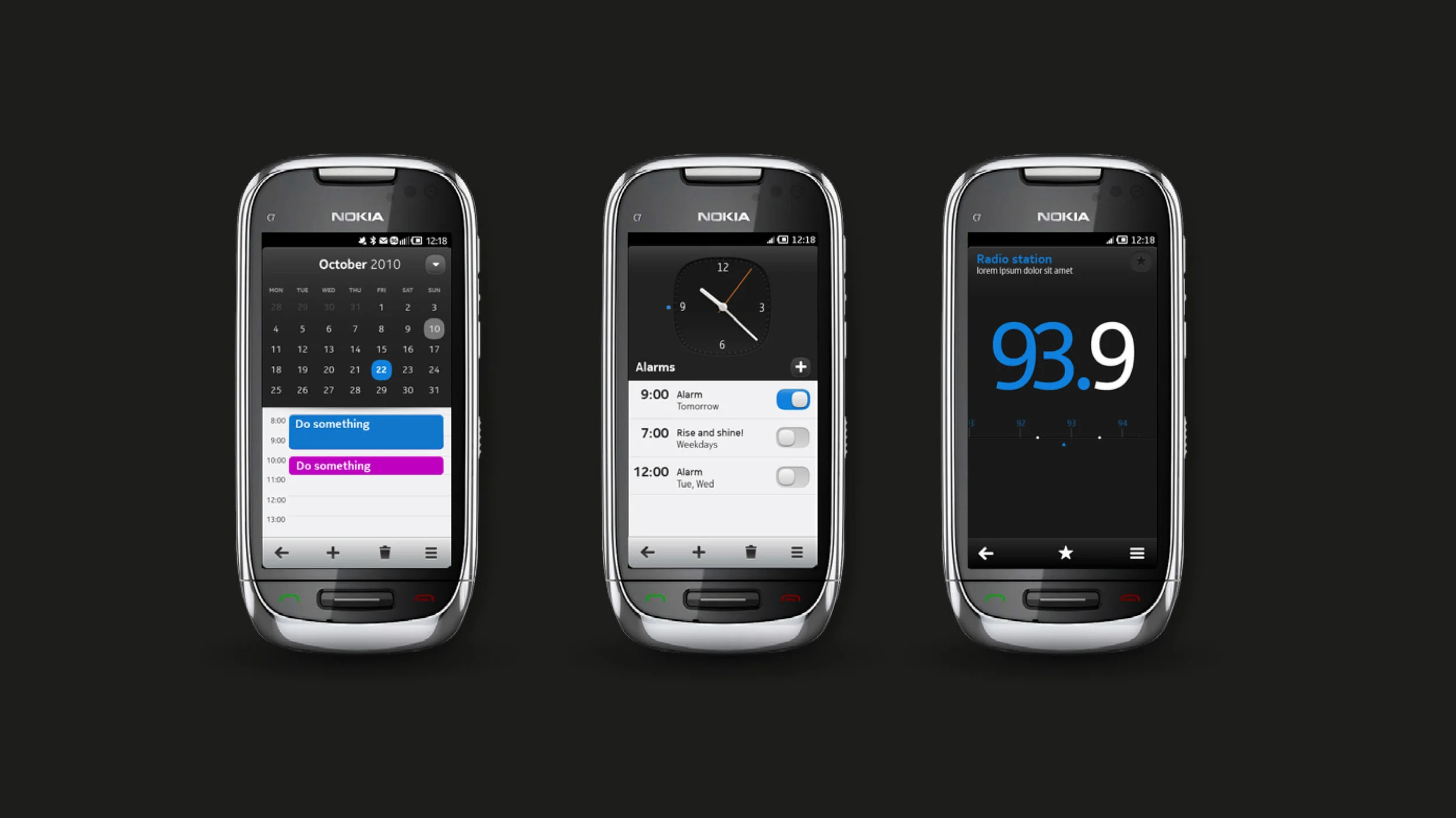
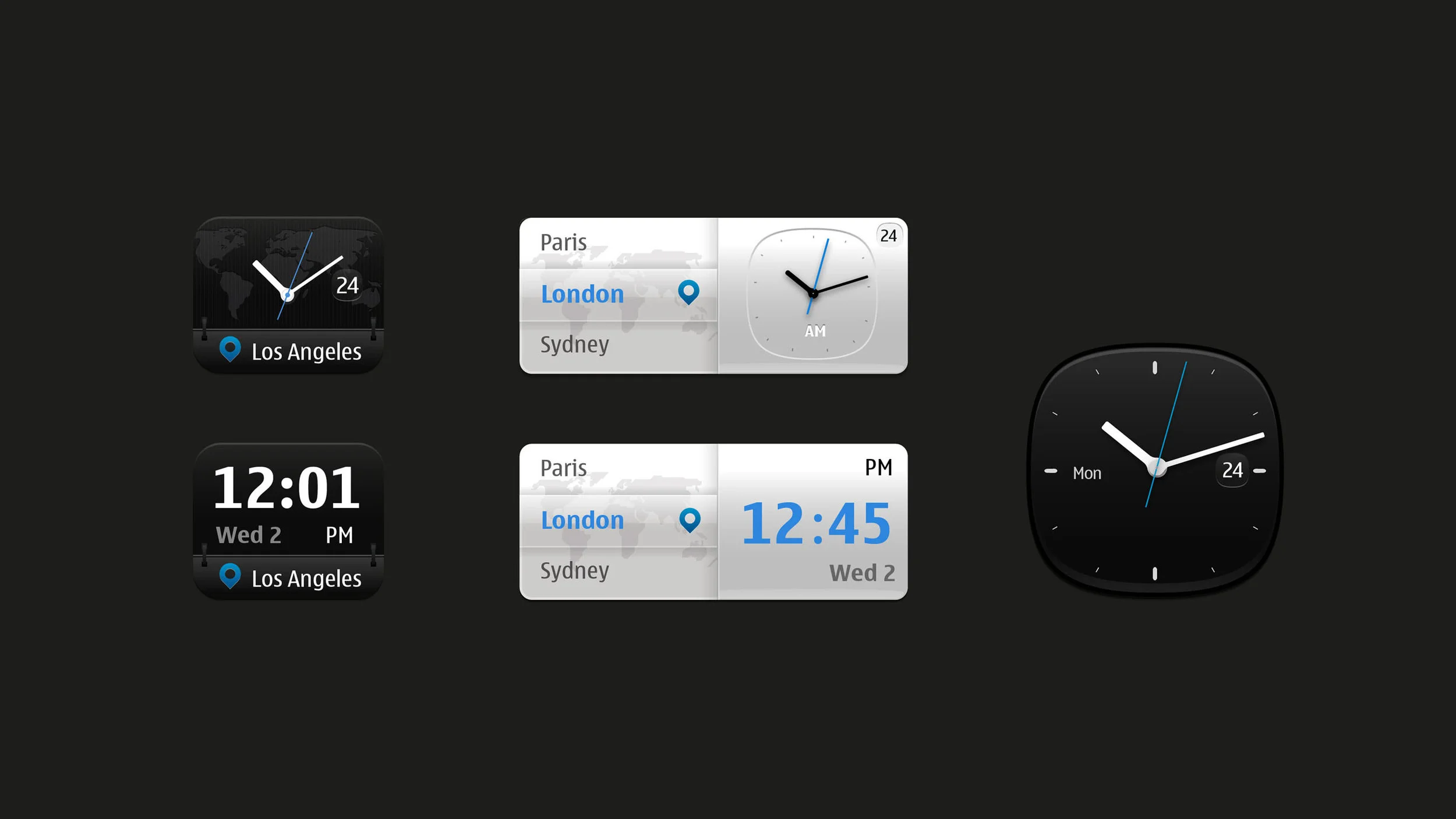
Integrating Nokia digital brand experience
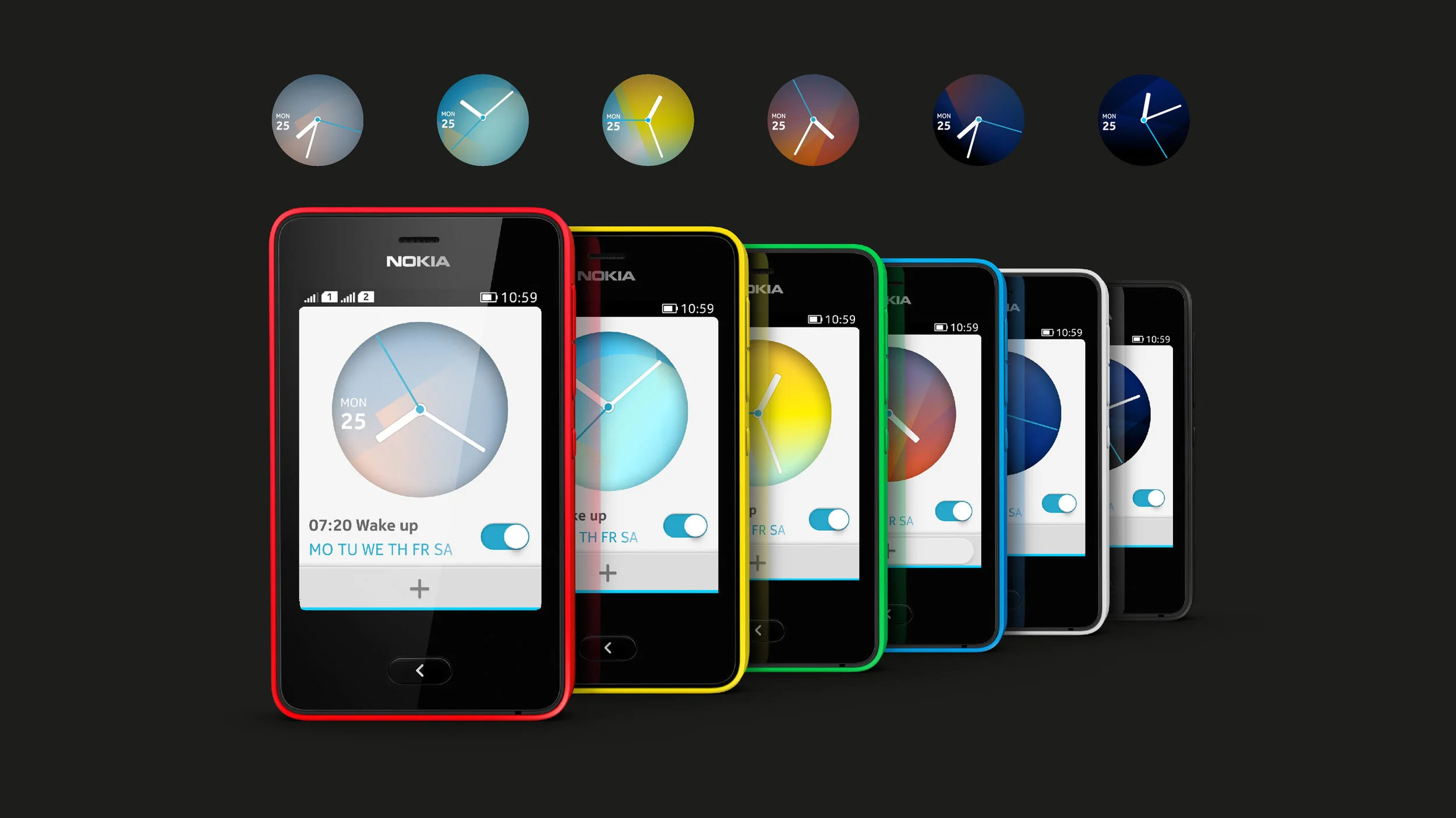
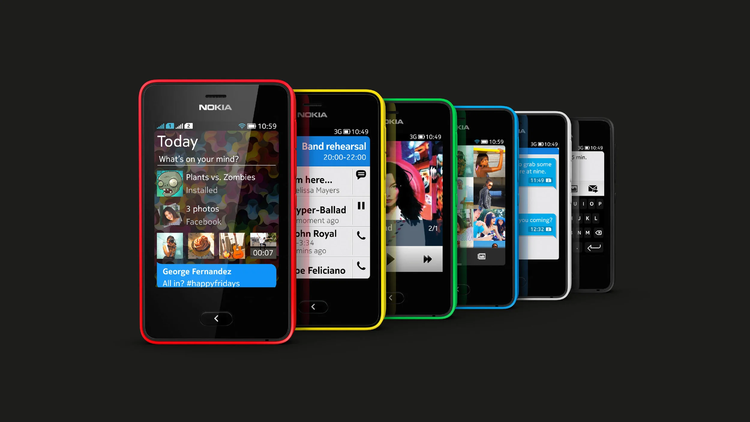
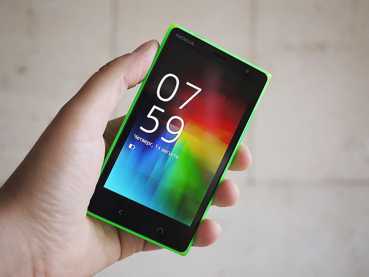
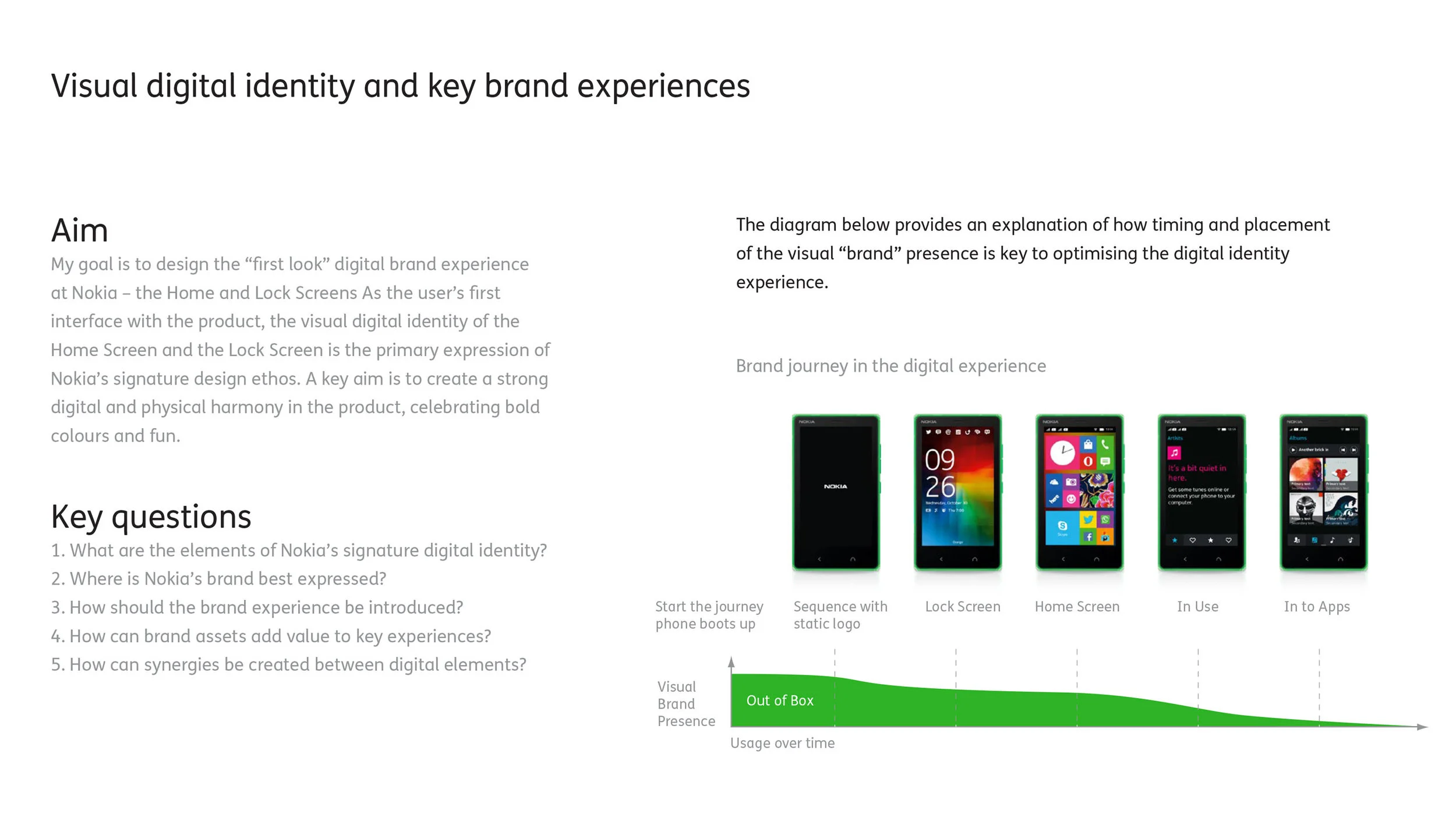
By combining consumer and societal trend analysis between the user and the device, I worked to focus the Nokia digital identity on aspects of visual and functional product design.
For pictograms that are to be rotated, we recommend using an angle of 30°. Although this to be followed strictly with strike-throughs, but some pictograms simply look better rotated at another value.
The pictogram is centred and should be constructed to sit perfectly on a pixel grid, using whole pixel measurements. This also includes negative spaces.
